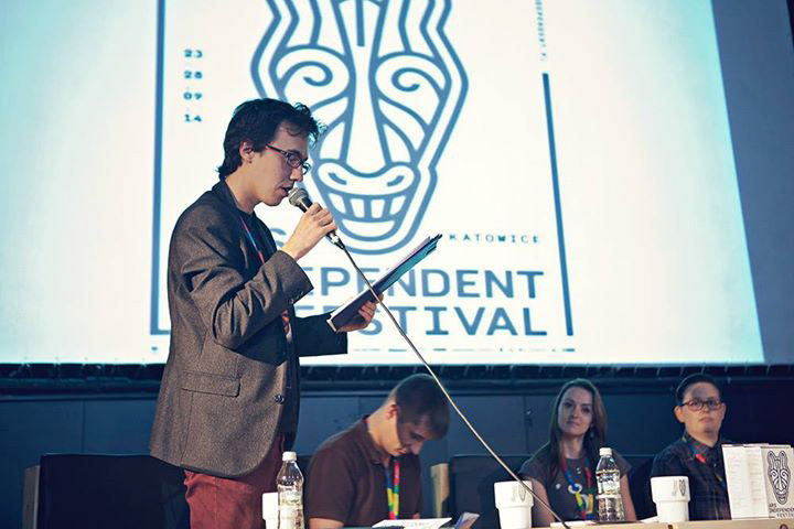
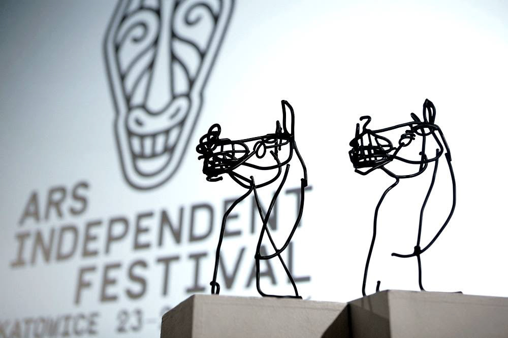
Ars Independent Festival is an annual, interdisciplinary event dedicated to audio-visual culture in Katowice. The core of the festival is a presentation of international cinema, which is the starting point for exploration of other cultural texts (animation, music, and video games). At the heart of Ars Independent are the competitions: Black Horse (feature films) and Black Horse of Animation (animated shorts). 2014 was the 4th edition of the festival. The trophy in the film competitions, in addition to the Black Horse title and the financial prize, is a statuette of a horse, made by Olaf Brzeski. Its body is formed from black metal rods, interconnected and bent in Brzeski’s signature style. The statuette is far removed from classic depictions of the animal. It leaves an ambiguous, tragicomic impression. The sculpture became the basis for creating the graphic sign to identify Ars Independent. From a certain perspective and photographed from above, the figure started to resemble African animal masks. In this way, combining the sculpture of a young Polish artist and tribal art, the distinctive image of the Black Horse was born. Rebellious, untamed, non-normative – just like the films, animations, music and video games presented at the Ars Independent.
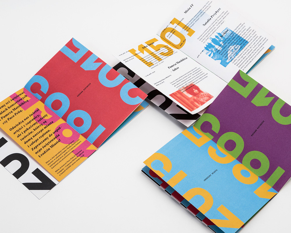
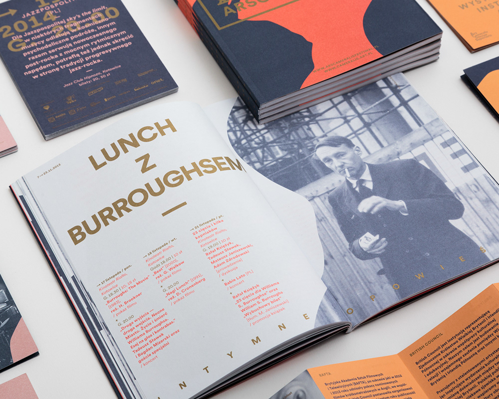
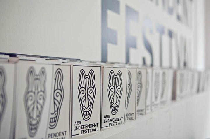
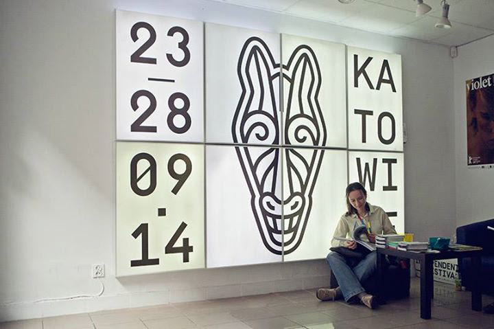
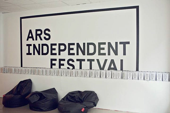
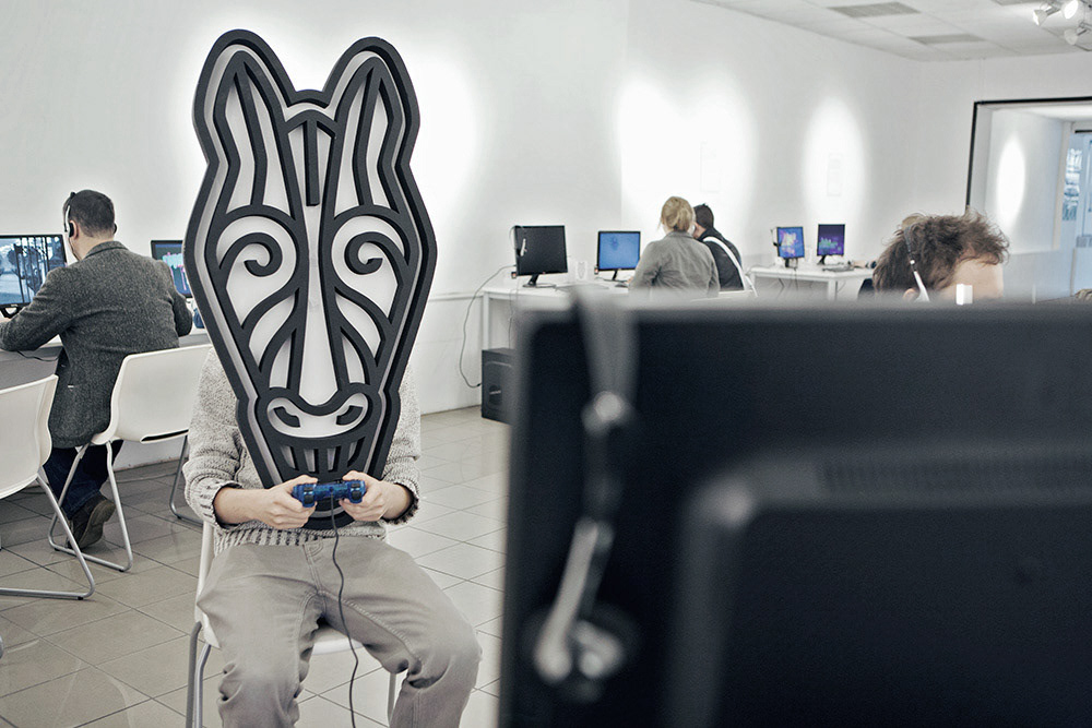
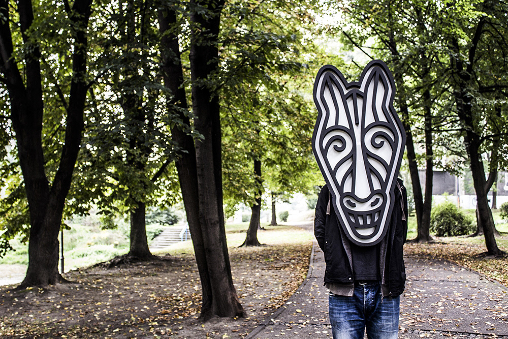
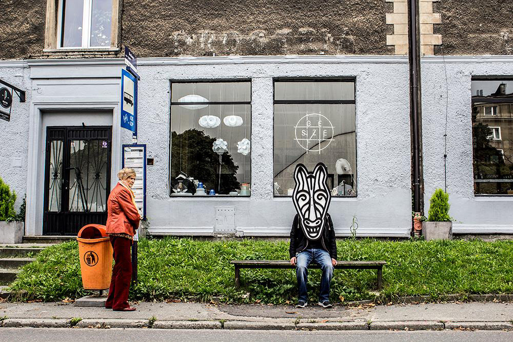
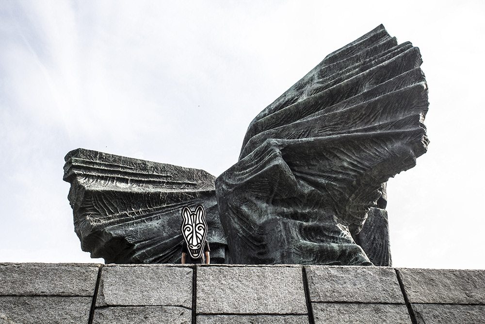
Ars Independent before the 4th edition faced the problem of incoherent and not very distinctive visual identity system. For three years, each edition presented a different approach to the subject, making it difficult to build a recognizable brand with positive associations. The new identity based on the Black Horse idea allowed not only to give a distinctive visual style to the Ars Independent, but also to better define its ideological and programmatic lines. It was decided that the new logo and other elements of the identity inspired by it will stay with the festival for good. The Black Horse pictogram is constructed of black lines (a reference to the black rods of the statuette), its aspect ratio (1 to 2) and axial symmetry reflect the shape of African masks. The sign is accompanied by Simplon BP and Simplon BP Mono typefaces, whose elongated, technical letter shapes complete the character of the logo. All photographs in the promotional materials were edited in a specific way, using halftone effects and shape distortion. It helped achieving a psychedelic, punk aesthetic. Another surprise were materials printed on mirrored Plexiglas (access passes) or Chromolux (invitations, business cards). One’s face could be seen reflected in them, with the interposed image of a mad horse. The catalogue was also interesting, with Swiss binding and a cover of laminated canvas and thin cardboard. Jagged edges of the cover, large hot-stamped horse pictogram, and visible stitching on the spine stressed the grunge atmosphere of the festival. Materials designed for the festival included 2 posters, 152-page catalogue, die-cut leporello leaflet, access passes, tickets, stickers, tattoos, bags, and mugs. A large horse mask was made, and a figure wearing it appeared in various places in Katowice during the festival.
Studio photos — Barbara Kubska
Outdoor photos — Michal Jedzejowski
